


Composition
This page is more of a mixed bag than the others. Here, I have compiled various "compositional" projects, or projects with a focus on the arrangement of elements.
The bottom two projects were long-term iterative assignments, where every class would have me making several more variations on a single concept: either to conclude with a most ideal design, or to simply strengthen my creativity under limitation.
Graphic Design 100


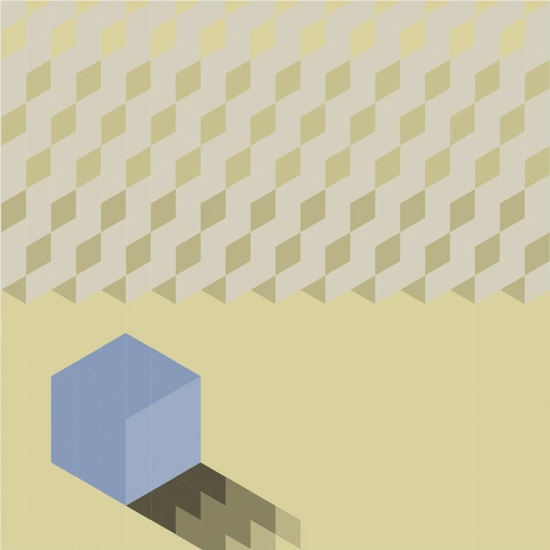
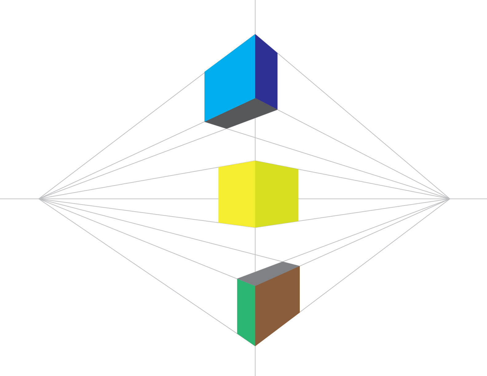
Above are compositions meant to guide your eye around the frame in a certain way. Take a close look at each image, and try to trace a line with your gaze.
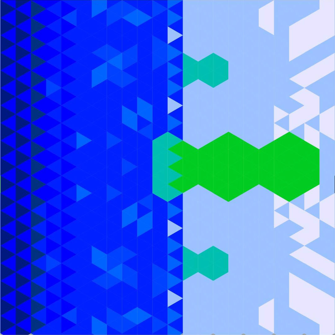
Below are compositions made out of triangles, and each meant to utilize a diferent type of color pallet.


Digital Concepts / Tech in Art
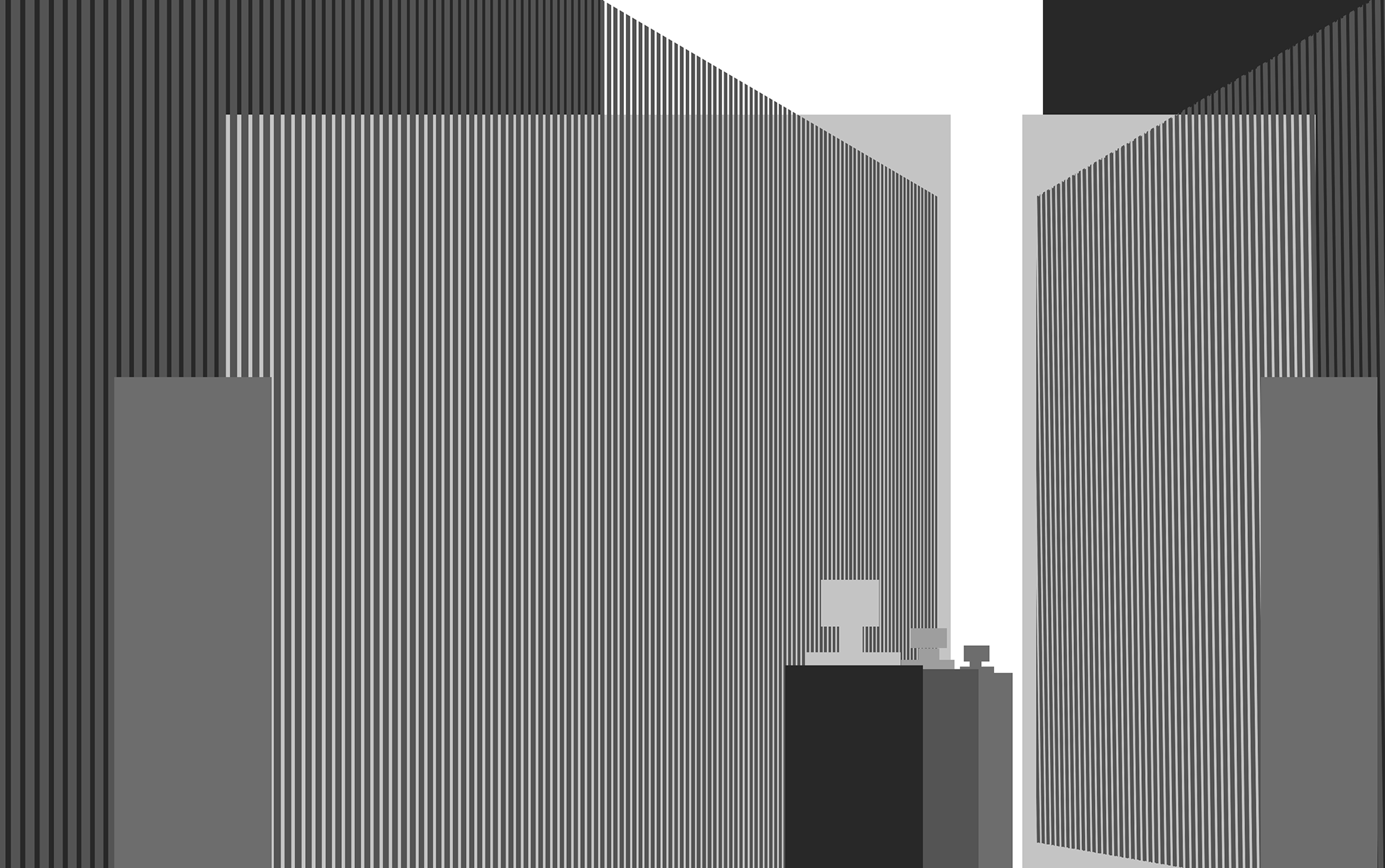
The leftmost image is a digital painting where I explored composition with household objects.
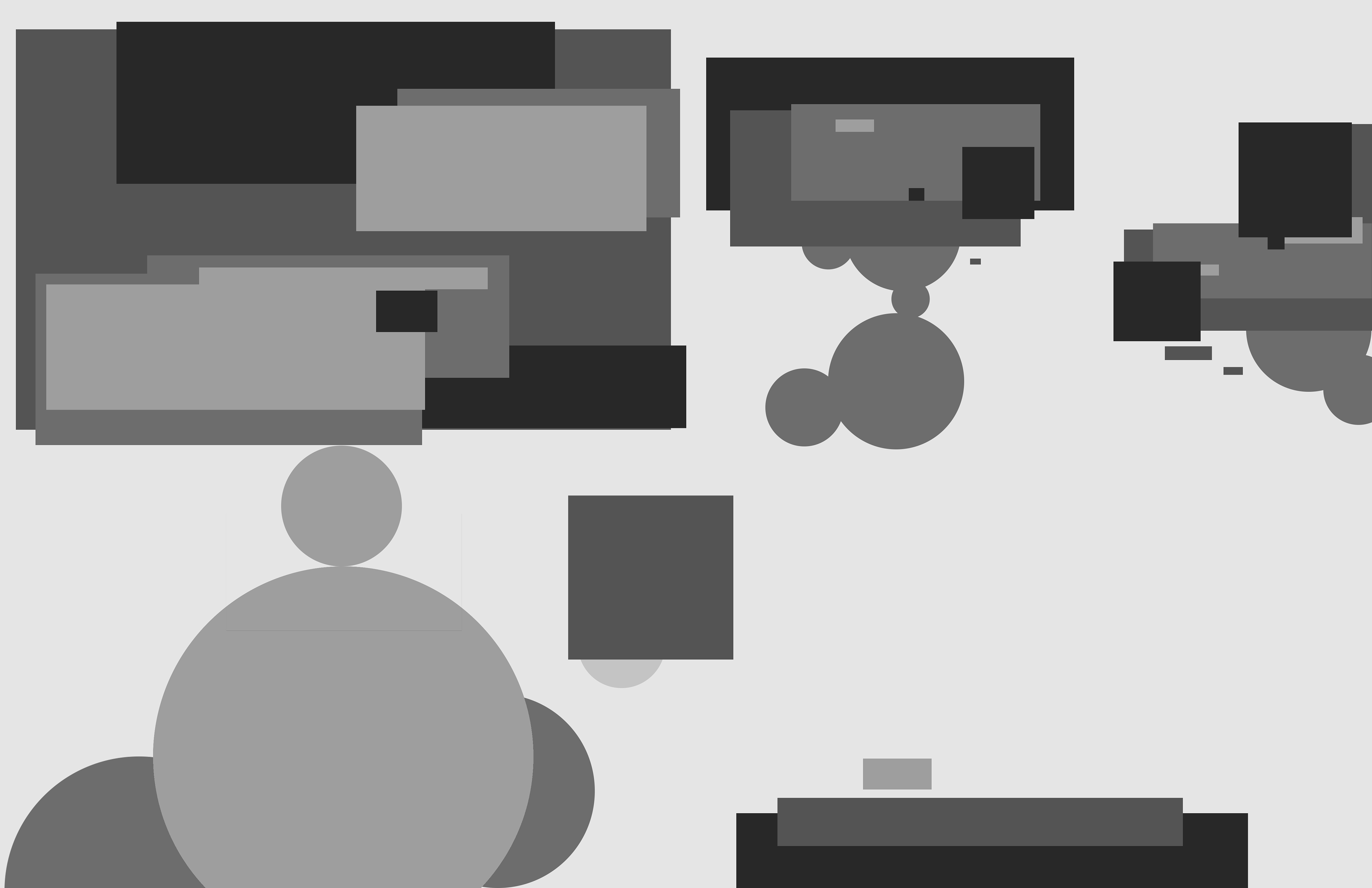
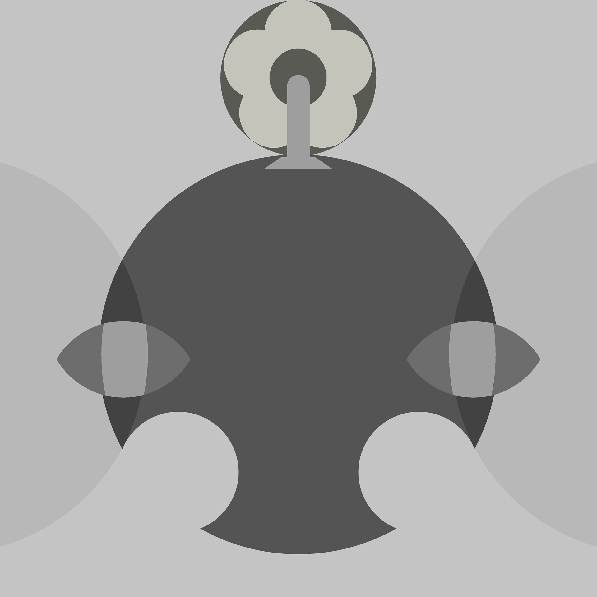
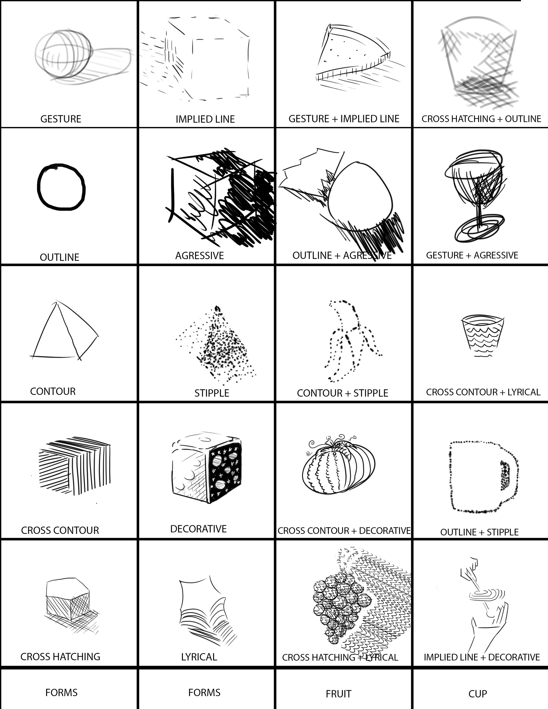
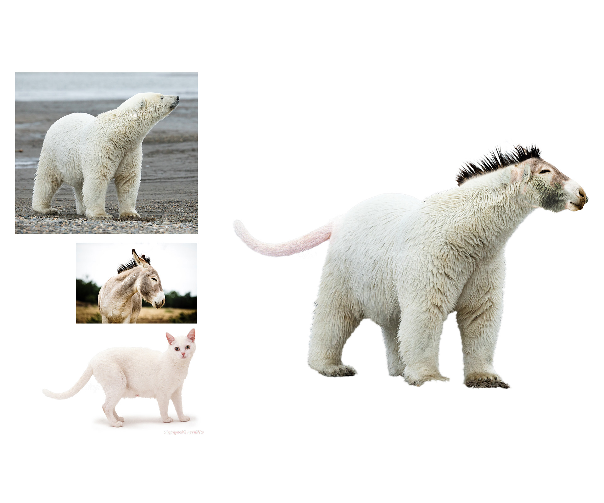
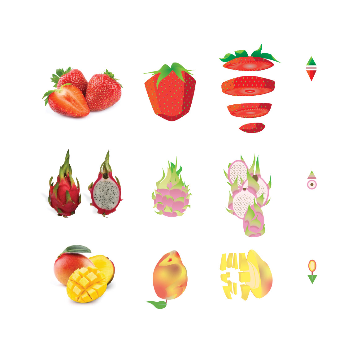
On the right are various other digital art assignments from this class that I wanted to share.


Graphic Design 200
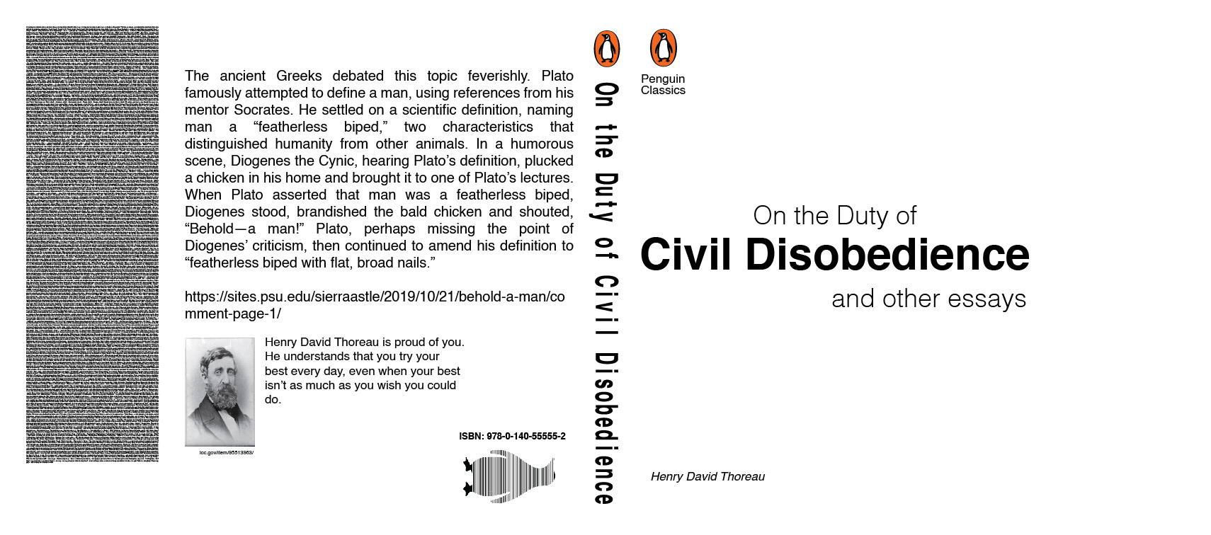
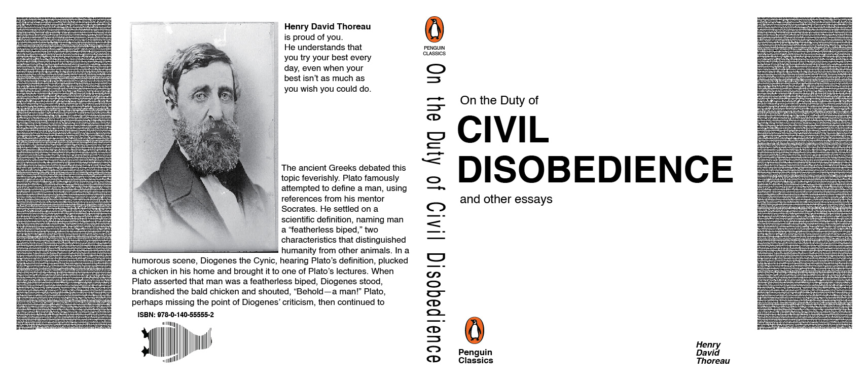
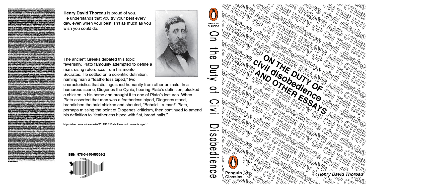
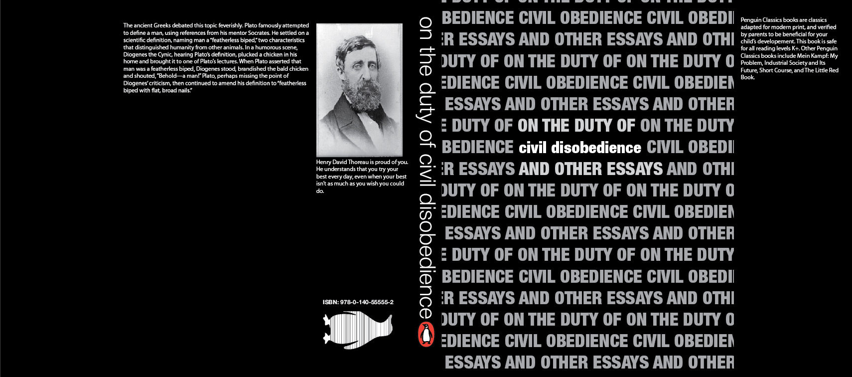
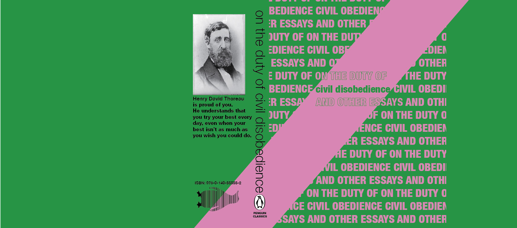
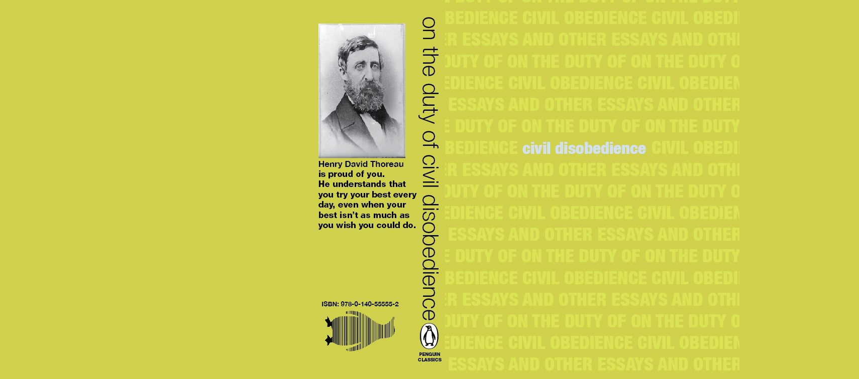
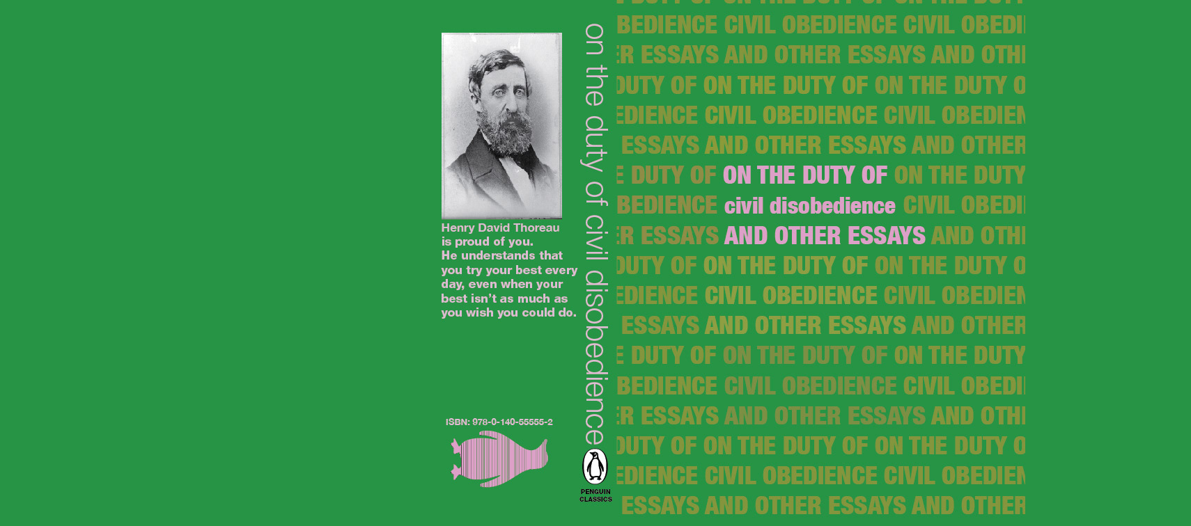
Working from black and white up to color was never my strong suit, but that is what this next project entailed. I was to design a book cover for the works of Henry David Thoreau. You may find the fine print humurous or nonsensical, as my earliest drafts needed filler text and lorem ipsum was forbidden.


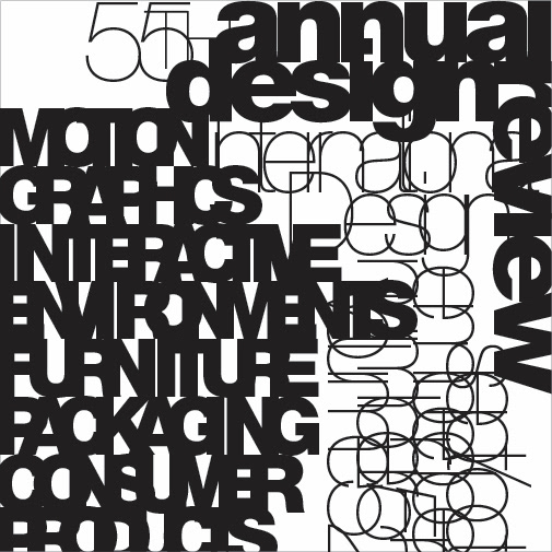
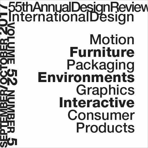
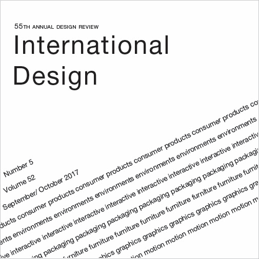
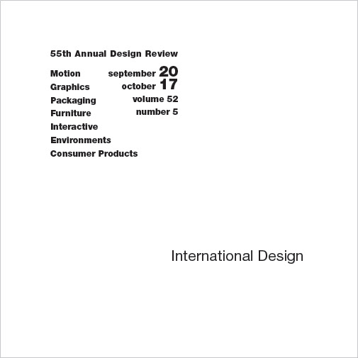
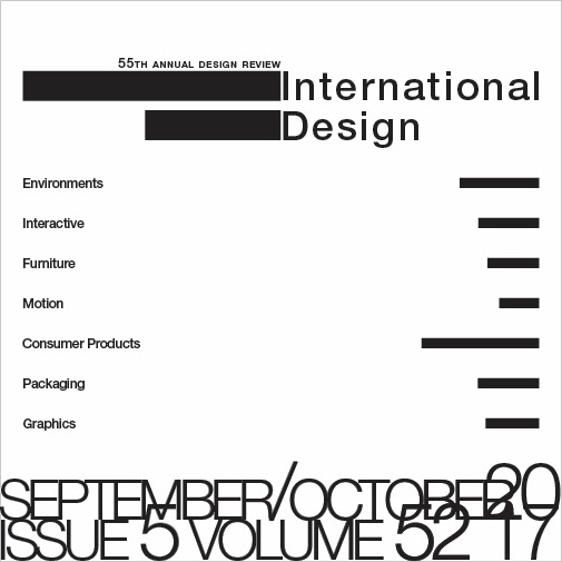
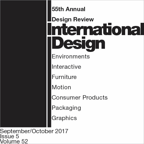
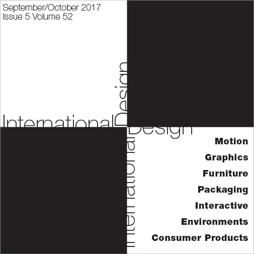
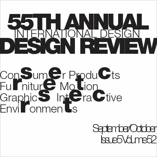
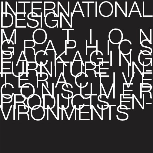
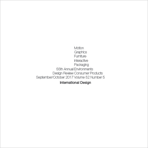
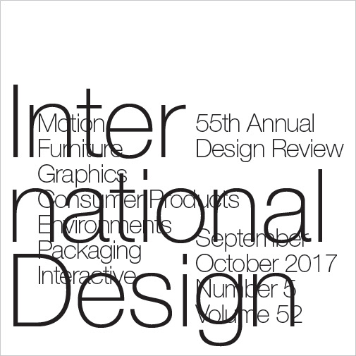
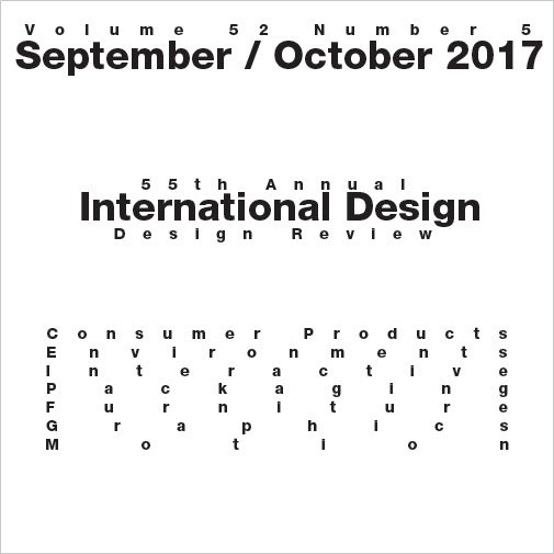
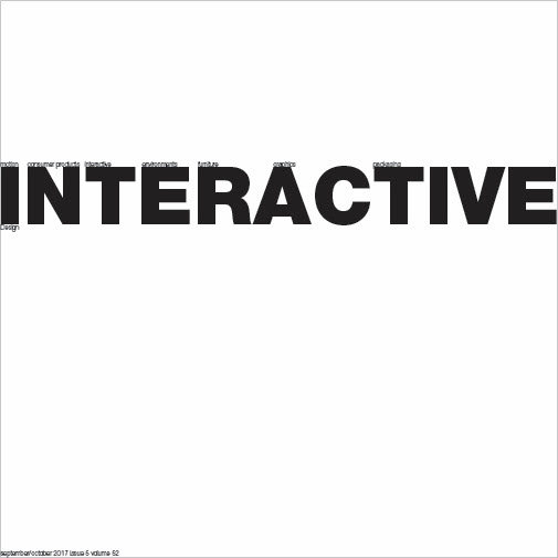
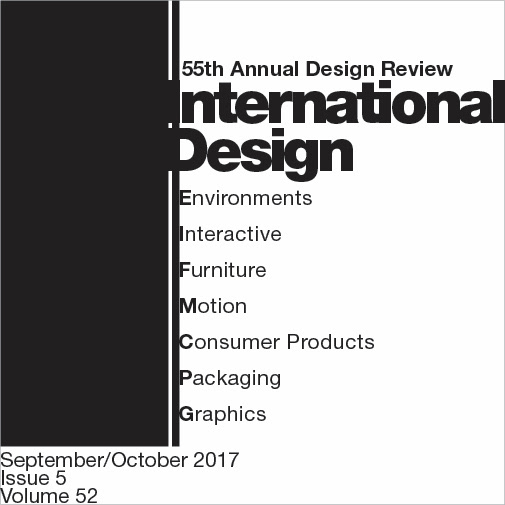
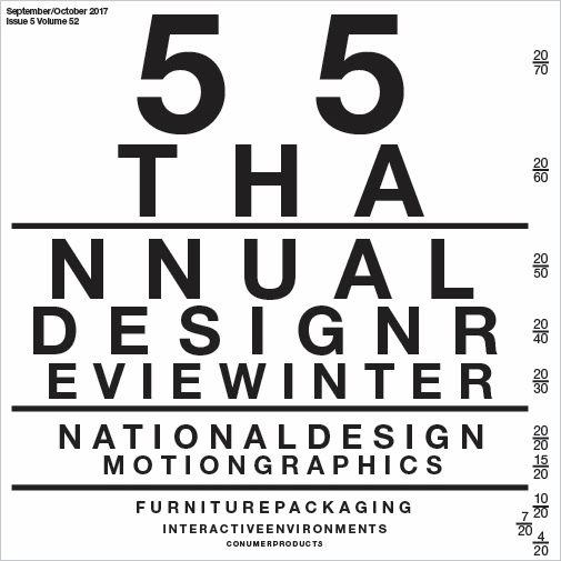
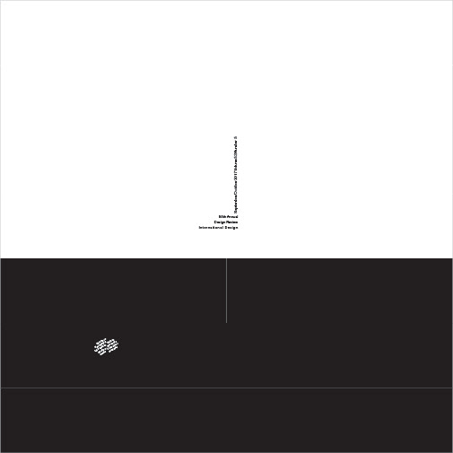
Typography Design
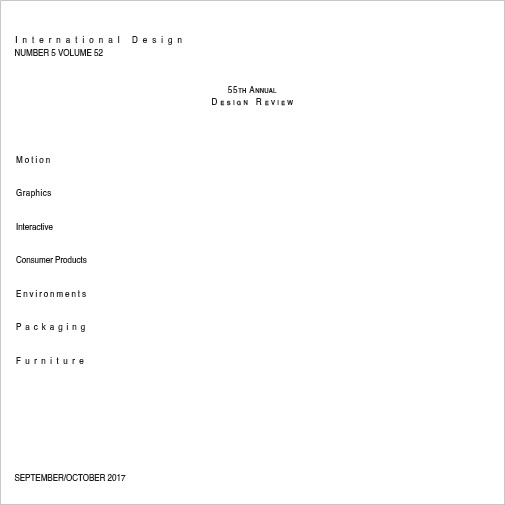
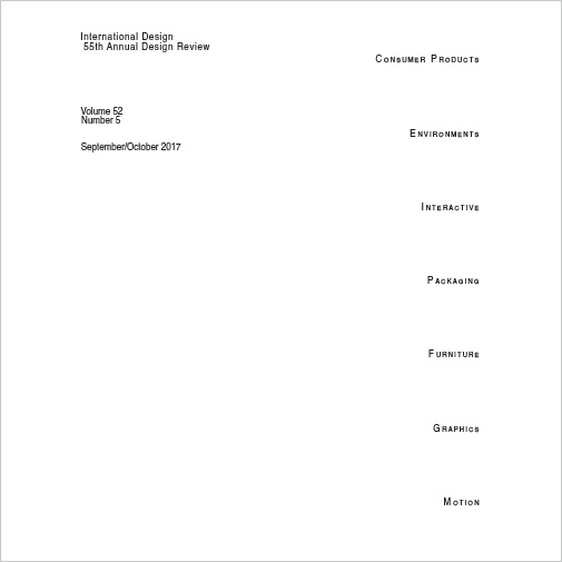
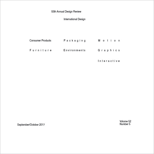
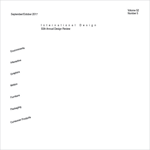
Working in strictly black and white is different from working in black and white, and later adapting for color. This multi-week long assignment had me creating five iterations of the same "magazine cover" each class, which each set made under certain restrictions.
However, more often than not these restrictions acted as prompts for me to find new and creative ways to arrange the limited words that we had to use. Each class period would have us print out our designs and have a group review. I learned the most by taking inspiration from my peers.
The 46th design is not part of the assignment, but I included it here because I enjoy the Windows XP aesthetic.